

Pantone releases its “Color of the Year.” The color is meant to reflect the current cultural mood and forecast of upcoming trends in the design world, and this year the company has selected Viva Magenta.
We’re certain Pantone has high hopes for 2023, as Viva Magenta is a vibrant, bold shade of pink that evokes feelings of energy, enthusiasm, and creativity. According to Pantone’s website, the color reflects a shift toward positivity and optimism in a post-pandemic world and is a reminder to embrace life and all its opportunities.
This rich hue is sure to be a popular choice in home décor in the coming year and following are some suggestions on how to incorporate the versatile color into your home.
Viva Magenta is a big color that most people will want to incorporate carefully. One of the best ways to add the color throughout your home is with accents, for example throw pillows, a vase, artwork, or fun accessories like coasters.
For bathrooms, consider candles, towels and bath products that add small doses of the shade for a big impact.
Because Viva Magenta pairs well with both bold colors including oranges and yellows, as well as neutral colors, it can be used with a variety of color schemes. When paired with softer shades, such as pastel pink or baby blue, Viva Magenta takes on a playful and lighthearted vibe.

For those willing to take a more daring approach to decorating, an accent wall using Viva Magenta will add a visually striking focal point in any room. Whether painting a wall or selecting a unique wallpaper that features the color, the room will surely be the conversation piece of your home. If you decide to incorporate an accent wall in Viva Magenta, just be sure to balance the rest of the room with neutral tones so as not to overwhelm the space.

If you’re sold on Viva Magenta and want to commit to the color, furniture can be a stylish way to add personality to your home decor. A sofa, for example, can serve as a statement piece, drawing the eye and creating a focal point in the space. Similarly, a chair, side table or bookshelf can bring a sense of drama and energy to a room.
It’s important to consider the size and scale of furniture pieces in relation to the rest of the room. Large, bold furniture can overwhelm a small space so consider opting for small pieces. It can also be helpful to balance the vibrancy of the color with calming elements such as natural wood accents. With a thoughtful approach and sense of balance, pieces of furniture in Viva Magenta can be a striking addition to your home.
Regardless of how you decide to use Viva Magenta, it is a must-have color for 2023. Embracing this vibrant hue is sure to brighten up any space while adding some exuberance to your home.


Other companies have also released their colors of the year. Here is a list:
Spanish Moss by KRYLON
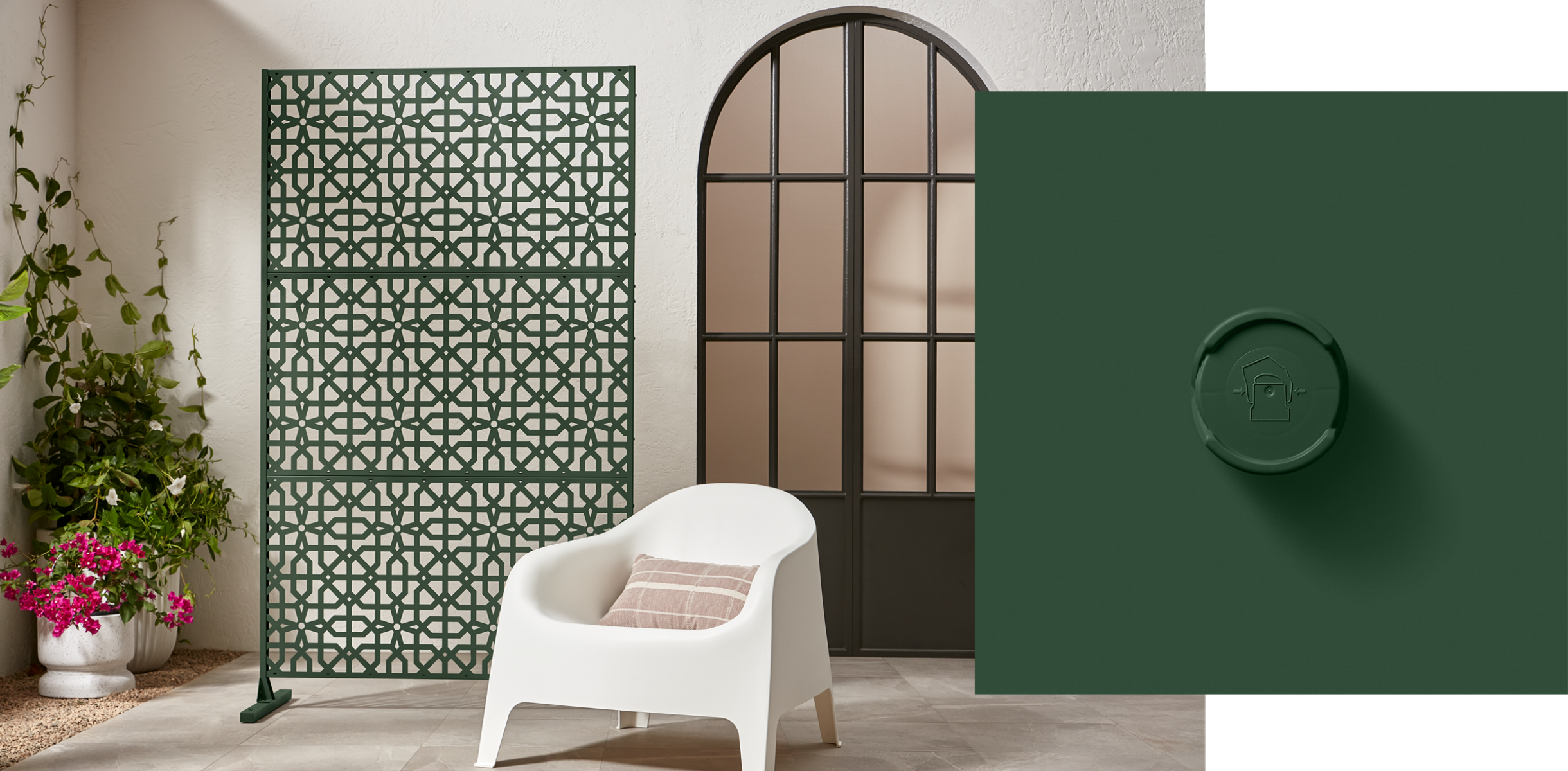
“It's described as a midnight green that has a strong connection with the richness of nature, dense forests and mossy terrains. Rooted in the renewing power of green, it can balance with both warm and cool accents.”
Raspberry Blush by Benjamin Moore
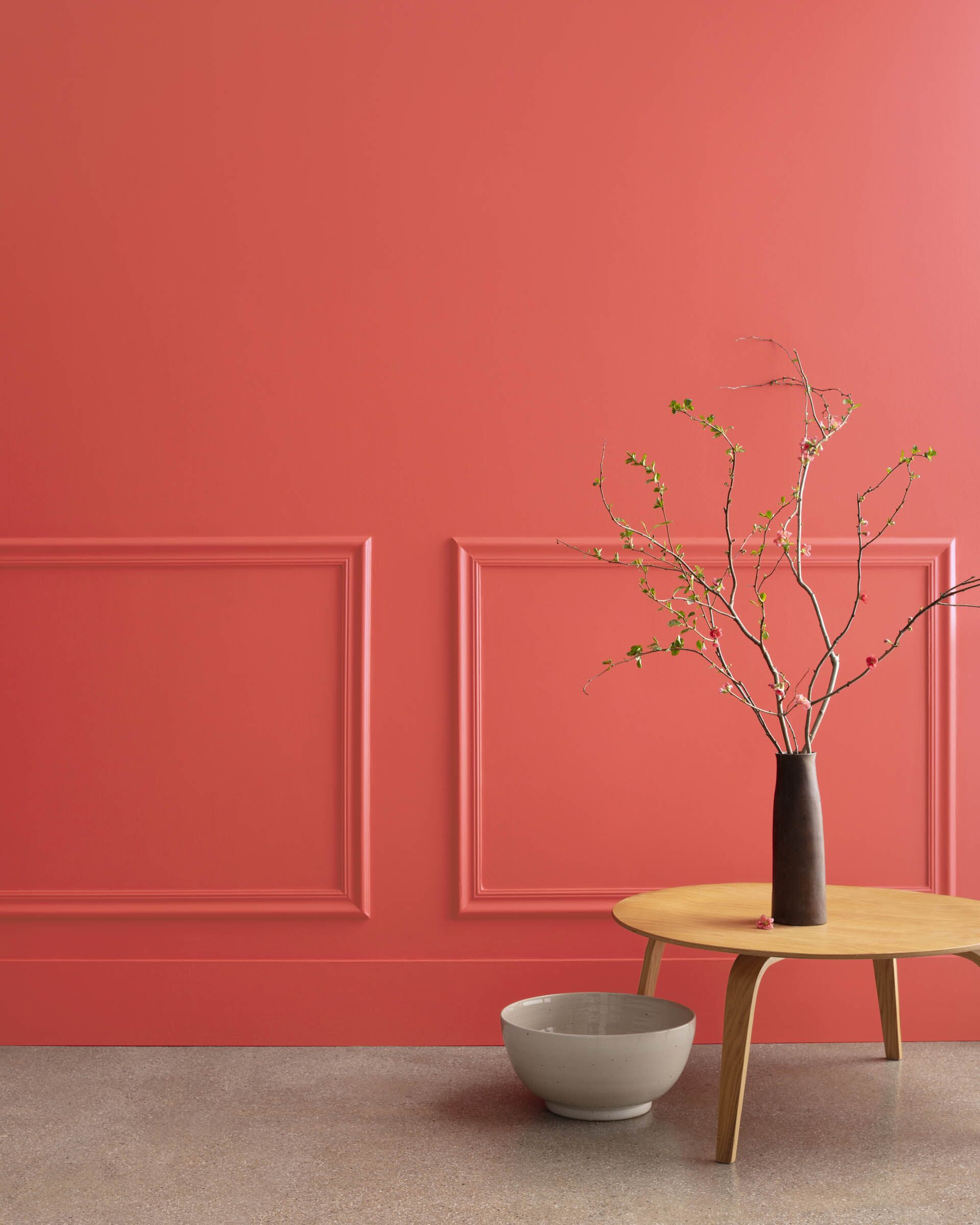
It's described as a vivacious shade of coral tinged with pink; this electric hue is the definition of charismatic color.
Terra Rosa by Dunn-Edwards
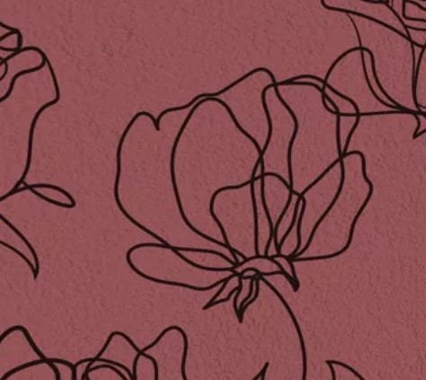
It's described as a deep, rosy pink hue with a touch of terra-cotta influence that exudes confidence, creativity and coziness.
Redend Point by Sherwin-Williams
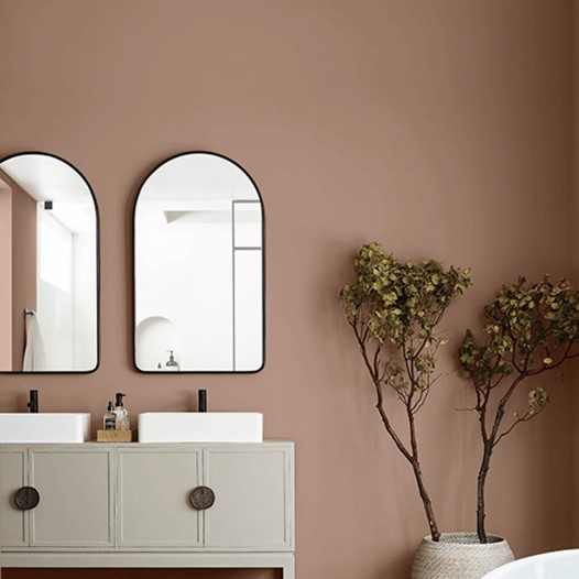
It's described as a blending of blush and beige, and features subtle pink undertones to warm up walls. The grounding shade feels especially on trend as homeowners turn towards earth tones to bring comfort and joy to their interior spaces.
Blank Canvas by Behr
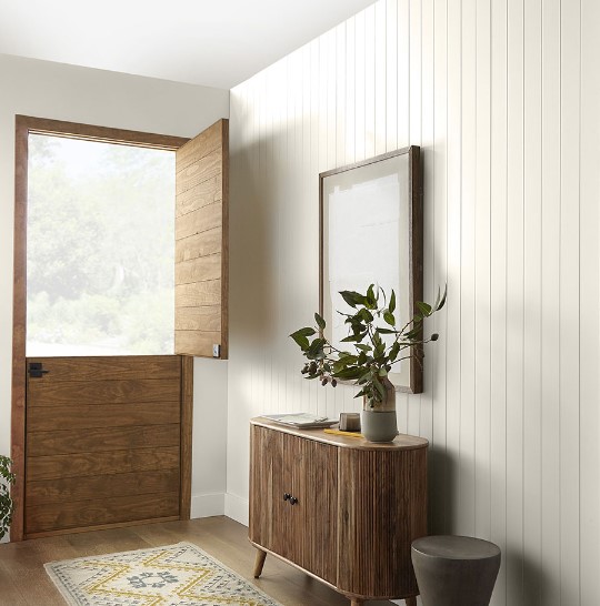
It's described as a creamy shade of white that goes with practically everything.
Vining Ivy by Glidden
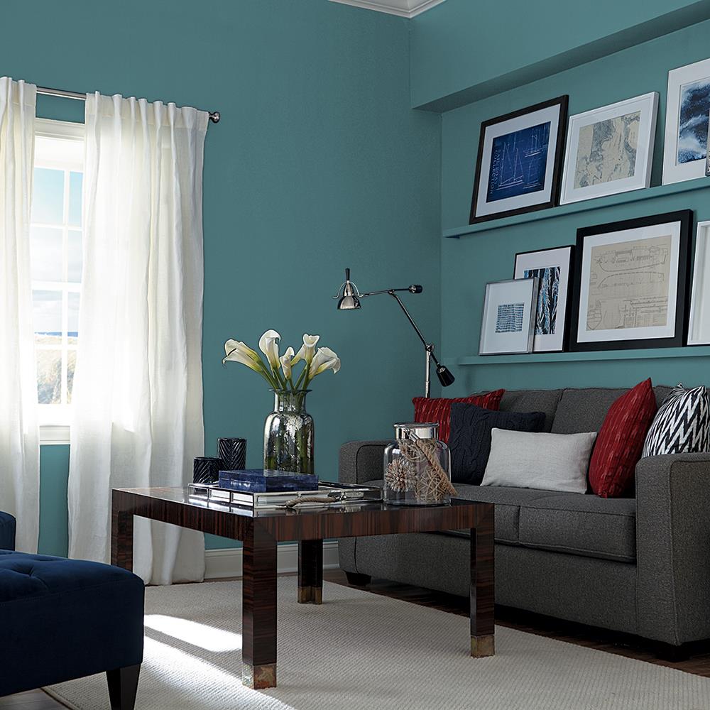
It's described as a teal that blends the best of blue and green into what Glidden describes as a "bluish-greenish-something-in-betweenish" color.
Rustic Greige by Dutch Boy

It's described as a blend of gray and beige with subtle red undertones that pair well with today's trending earth tones paint colors.
What are your favorite paint colors? Do you like any of these?

Your Trusted Resource for Real Estate
@properties shares my commitment to offering the most comprehensive and professional marketing, sophisticated technology, and expert market knowledge, supporting the highest standards of service and representation you expect and deserve. With local leadership and national and international reach, I bring results to clients wherever their buying and selling goals take them. I'd love to assist you. Whether you're in the research phase at the beginning of your real estate search or you know exactly what you're looking for, you'll benefit from having a real estate professional by your side. I'd be honored to put my real estate experience to work for you.
I appreciate and welcome your inquiry, real estate need, or referral!